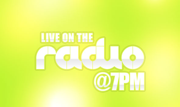
In just a few moments, you can add a vibrant splash to your text that will really add some pop-culture flavor to your designs! Great for spicing up banners and promotional material when time’s a concern.
Before getting started, you may want to grab a Pop-styled font to work with. Really, anything with a bold look will probably look great, but for that extra pop feel, you may be interested in trying out a font like:
Start out with a base color of your choosing (I chose an especially bright Lime Green: #b7f22b), and fill the entire background layer of your document.
Create a new layer.
Now, using a white foreground color, and a soft (0% hardness), large (300px-ish) brush, make a few dabs in your new layer. Set this layers blending mode to Overlay.
Repeat this process of adding new layers, painting a few dabs on each, and setting them to overlay to build up a nice lighting effect as shown in the example on the right. Varying the size of the brush, and overlapping your dabs will help add depth to your background.
For inspiration on type placement, try exploring various avenues that are well integrated in Pop-culture to see how they design their graphics. I tend to see more abstract combinations of text in such areas, along with frequent use of placing text at angles, and fitting words into one another. On a final note, to make this specific effect work best, you should use a White Font.
Below is an example I put together using CLUB and Impact:
Apply the layer effects shown below, making any modifications as needed.
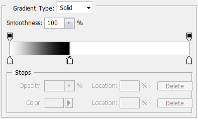
The gradient should be setup as follows:

This is a Text Effect Quickie — a tutorial that teaches an effect quickly, yet is an effective technique that can be used time and time again. If you’re looking for advanced tutorials, be sure to check out the rest of our Photoshop Tutorials on Tutorial9!
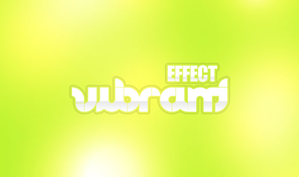
What We’re Making
This Text Effect Quickie will show you a real simple way to create a vibrant, poppy type in just a few minutes. It’s a great effect to use on promotional materials, posters, or even in website graphics!
Before getting started, you may want to grab a Pop-styled font to work with. Really, anything with a bold look will probably look great, but for that extra pop feel, you may be interested in trying out a font like:
- Club Font (Free Trial Version, or $5 for the commercial version)
- Snow Dream
- Advert
- Pop Magic
Step 1 – Background
The background is a key element to this effect. If the background doesn’t give off a poppy, groovy sort of feel, the text alone may not be enough to compensate for the loss.
Start out with a base color of your choosing (I chose an especially bright Lime Green: #b7f22b), and fill the entire background layer of your document.
Create a new layer.
Now, using a white foreground color, and a soft (0% hardness), large (300px-ish) brush, make a few dabs in your new layer. Set this layers blending mode to Overlay.
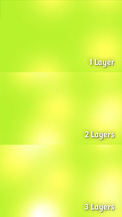
Repeat this process of adding new layers, painting a few dabs on each, and setting them to overlay to build up a nice lighting effect as shown in the example on the right. Varying the size of the brush, and overlapping your dabs will help add depth to your background.
Step 2 – Setting the Type
As suggested earlier, using a bolder typeface is probably a good idea for this effect, as legibility may become a problem with something too small or thin. Another thing to keep in mind when setting the type is the actual placement of letters. Since this is more of a Pop-culture effect, we want the actual placement of elements to depict such a style.For inspiration on type placement, try exploring various avenues that are well integrated in Pop-culture to see how they design their graphics. I tend to see more abstract combinations of text in such areas, along with frequent use of placing text at angles, and fitting words into one another. On a final note, to make this specific effect work best, you should use a White Font.
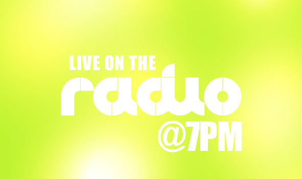
Below is an example I put together using CLUB and Impact:

Step 3 – Setting Up the Layer Style
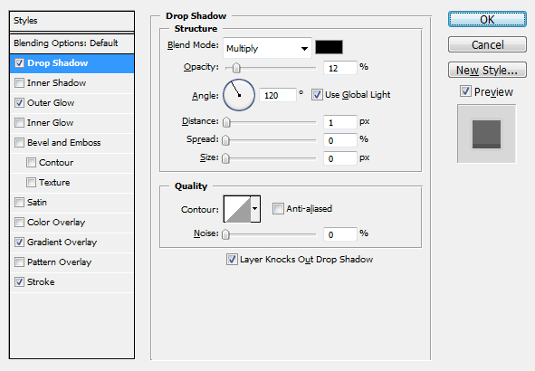
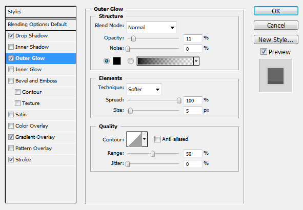
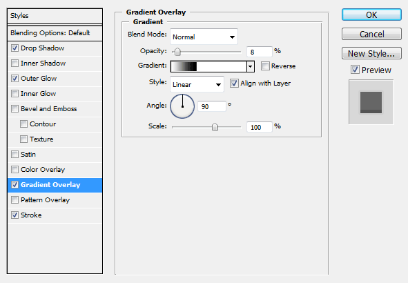
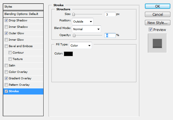
Go into your text layers Blending Options (Right Click Layer > Blending Options).Apply the layer effects shown below, making any modifications as needed.
Drop Shadow

Outer Glow

Gradient Overlay
We’ll need to build a custom gradient for our gradient overlay effect. If you’ve never built a custom gradient, I suggest taking a look at our Layer Styles in Photoshop Tutorial prior to this step.The gradient should be setup as follows:


Stroke Overlay
Download the Text Effect
If you’re looking for an easier way to apply the layer effects, you can also download our Vibrant Pop Text Effect for free! It’s still important to note that some changes may need to be made to the effects in order to fit your design.SR:-tutorial9
No comments:
Post a Comment