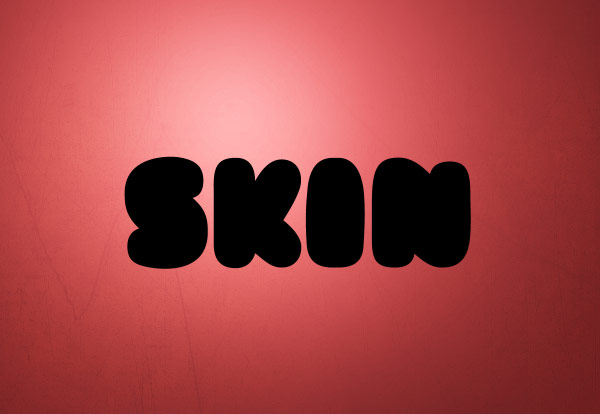
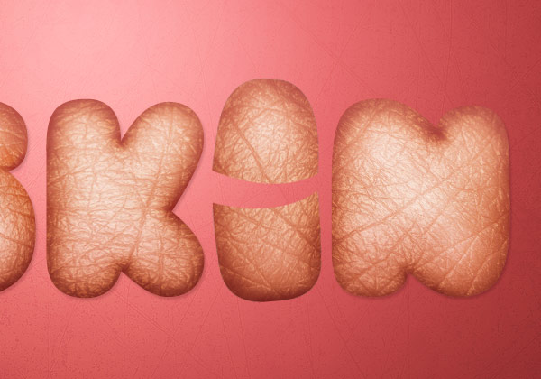
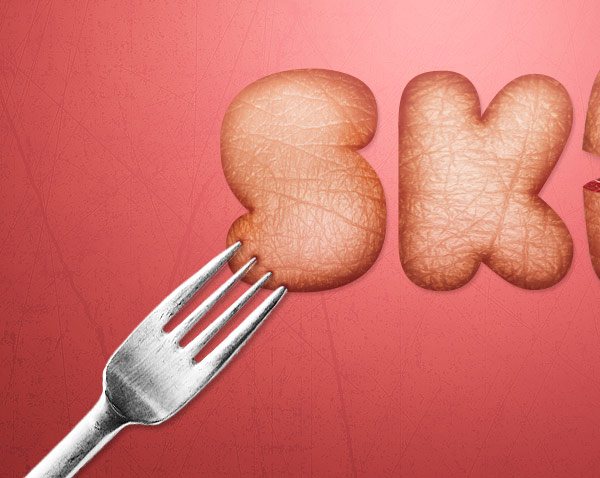
Preview
Click the preview image to see the final result in full size. Photoshop updates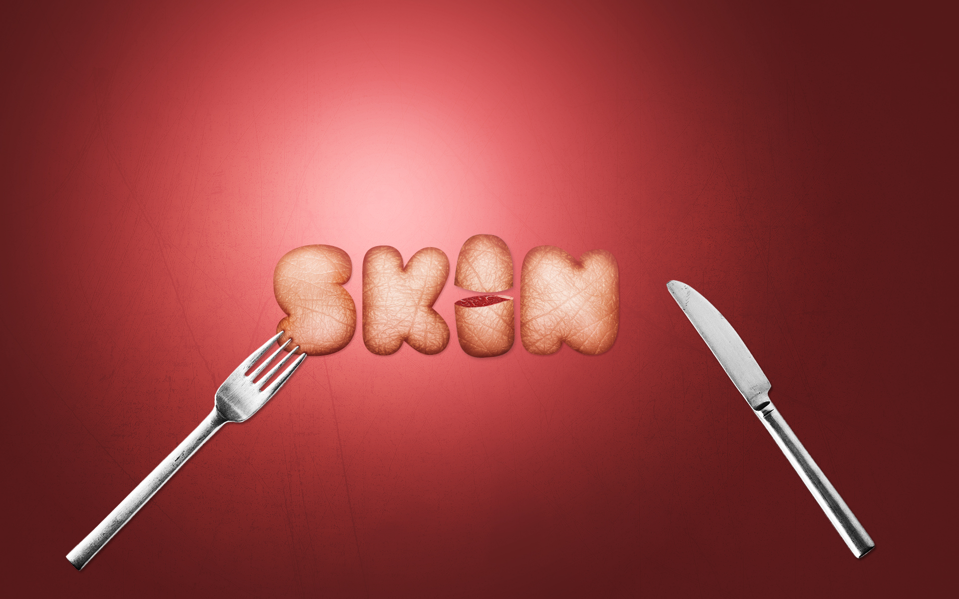
Tutorial Resources
- Scratched Metallic texture by WeGraphics
- Skin texture
- Meat
- Fork and knife
- Doughboy font by Typecode
Step 1: Create a New Document in Photoshop
Let’s start by creating a new document in Photoshop. Since I want to create a graphic that can be used as a desktop wallpaper, my document’s size is rather large, 1920×1200 pixels — but you are free to choose the size of your canvas to best suit your needs and preferences.
Step 2: Create a Radial Gradient to the Background
Apply a radial gradient to the Background layer using the Layer Style dialog window; double-click on the layer to access the window. From the Layer Style dialog window, select "Gradient Overlay" and add a gradient with the Style option set to Radial, and the gradient going from a light red (#e45f5f) to a darker red (#7a2424).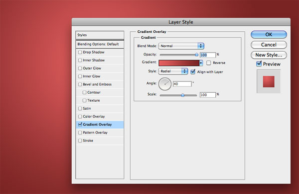
With the Layer Style window still open, you can move the center of the gradient by simply clicking and dragging over the canvas. Notice that if the Layer Style dialog window is closed, you won’t be able to move the gradient. I’ve moved the center of the radial gradient to the top left of the canvas.

Step 3: Add a Texture to the Background
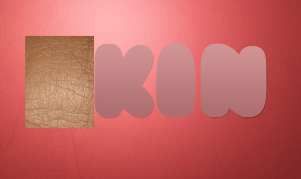
I love to "dirty up" the backgrounds of my compositions a little bit using grunge and paper textures. So let’s download a texture from my Scratched Metallic textures set (the free sample will work fine) and paste it into our document. Alternatively, feel free to experiment with textures of your own, or check out the Freebies section here on Design Instruct.Press Ctrl/Cmd + T to activate Free Transform mode and scale down the size of the texture to fit our canvas.

Set the layer’s Blend Mode to Overlay and reduce its Opacity to 20%.
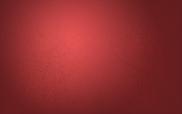
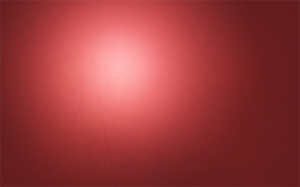
At this point, I think the focal point of the composition needs more light. So create a new layer and move it between the Background layer and the texture layer. Grab the Brush Tool (B) and set it up so that you have a large, soft, white brush with Hardness at 0%. Then, just click once on the canvas to create a round brush stroke. Reduce the Opacity of the layer in case you think the light effect is too strong.
Step 4: Adding the Text
We can now add the text. It’s essential to choose a good font. The idea is to work with a skin texture, so a round, bold font is what we need to obtain for an awesome and high-impact composition. After surfing through many font directories like dafont.com, I’ve found a free font called Doughboy that is perfect for our graphic. If you want to use that font, download it and install it.With your chosen font, write something onto the center of the canvas using the Horizontal Type Tool (T). Make the font size fairly large because it is the main element of our piece. The word I wrote was simply the word "Skin."
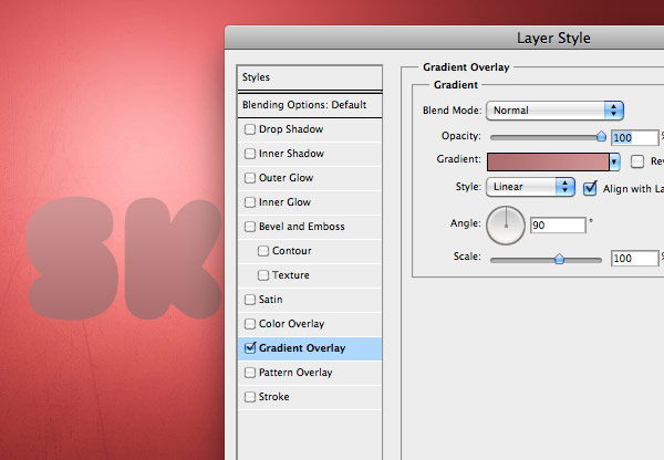
The first thing we have to modify is the text’s color, so right-click on the text layer in the Layers Panel and select Blending Options from the menu that appears.
In the Layer Style dialog window, add a pink linear color gradient going from #ab6e6e to #d19494.
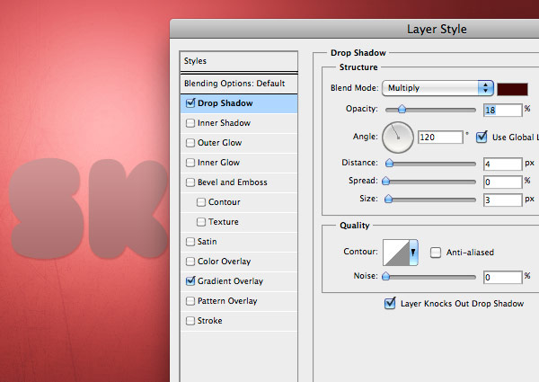
Secondly, add a soft drop shadow (color should be #3f0202).
Step 5: Adding the Skin Texture to the Text
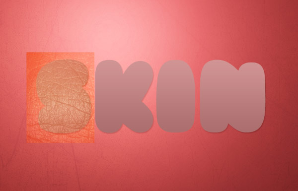
The process of applying the texture to the text is very simple and can be used to apply any kind of texture to any kind of text. The technique I will share with you is based on the concept of light and shadow distribution.Let’s start by downloading the texture and pasting it into the canvas.
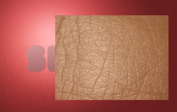
Resize it and locate the texture above the letter "S". We will work on one letter at a time. Take in mind that if you resize the texture, you will add finer details to each letter.
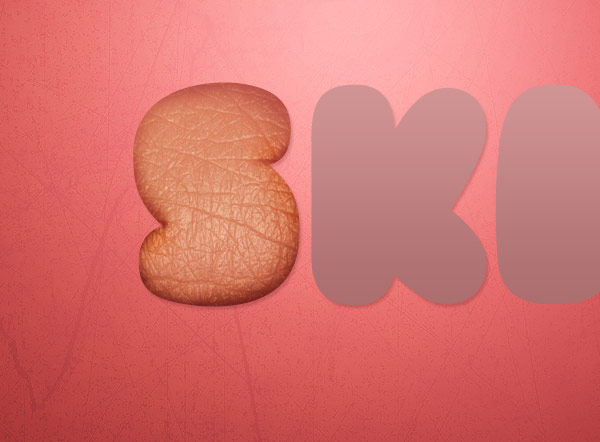
By setting the texture layer’s Blend Mode to Overlay, you can preview how the texture will affect the letter.
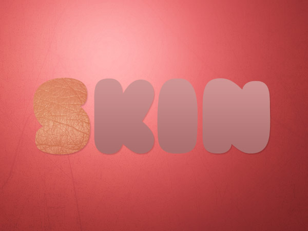
To mask out the extra parts of the texture, Ctrl/Cmd + click on the text layer to select around it, and afterwards, add a layer mask onto the texture layer by pressing the Add layer mask button in the Layers Panel.
Step 6: Create the 3D Effect on the Type
To create the illusion of perspective so that the text will have depth, we won’t be using 3D software. We will only rely on two powerful Photoshop tools: the Burn Tool and the Dodge Tool (O) to manually paint the illusion of depth.The Burn Tool is used to darken areas of objects on the canvas. The Dodge Tool does the opposite; it lightens up areas that you apply it to. They both work like brushes and in fact, you are free to use the brush library with them.
We will start using the Burn Tool to darken the edges of the letter. Dark edges give the idea of depth. Gently paint over the areas indicated by the red arrows using a large, soft brush with the Exposure at around 50%.
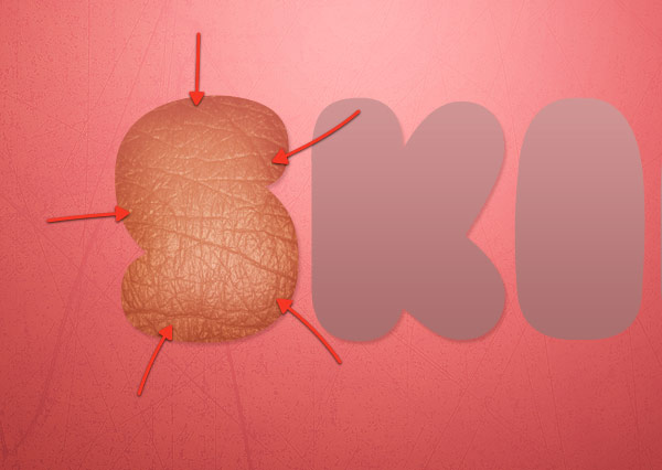
Reduce the brush size and increase the Exposure. Paint over the edges again, and you’ll see that, this time, the effect will be more visible. By varying our strokes and options, we will be able to create realistic highlights.
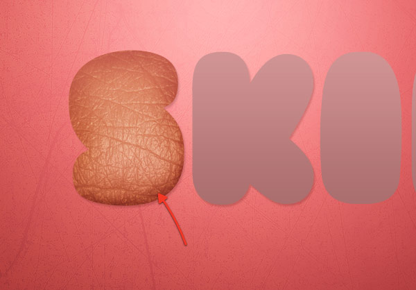
Continue using the Burn Tool until you’re satisfied with the result. Here is what I ended up with:
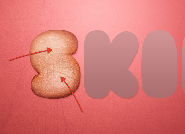
To give the letter even more depth, switch to the Dodge Tool and paint over the center of the letter (indicated with red arrows below).
Step 7: Apply the Texture to All the Letters
Use the same method we used in Step 5 and Step 6 to add textures to other letters, as well as to give them depth by using the Dodge Tool and the Burn Tool.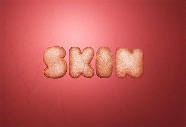
Step 8: Split Up the Letter "i"
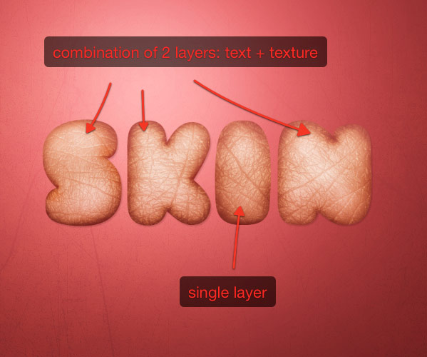
At this point of the process of designing this piece, I had an idea: these letters look like food. In particular, the letter "i" makes me think of a small salami — Hey, I’m Italian, and food is a big part of our culture!So what I wanted to do was cut the letter "i" to make it look like it is split open. There’s a complication to doing this, though: each letter is a combination of 2 layers, the text + the texture. To divide a letter in two parts, we have to create a single layer for that letter.
Let’s do that now. First, hide the visibility of all the texture layers (for the moment) so we can focus our attention on the text layer.
Rasterize the text layer by right-clicking on it in the Layers Panel and then choosing Rasterize Layer from the menu that appears.
Grab the Rectangular Marquee Tool (M) and select the "i".
Press Ctrl/Cmd + J so you duplicate only the "i" on a new layer of its own.
Next, we will remove the letter "i" from the original text layer. Again, select the letter "i" (or go to Select > Reselect), switch to the text layer and press Delete. What you should obtain at the end is a layer containing the letters "s", "k", "n" and a separate layer containing the letter "i".
You can now make all the texture layers visible again.
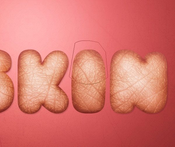
Select both the "i" layer and its texture layer in the Layers Panel and then merge them into one layer (Ctrl/Cmd + E).
Use the Pen Tool (P) in Paths mode to create a path that includes the top part of the letter "i".
Press Ctrl/Cmd + Enter to convert the path you just made into a selection.
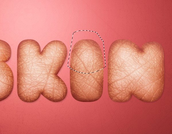
Make sure to have the "i" layer as the active layer in the Layers Panel. Use the Move Tool (V) to move the selection up, separating the upper and lower portion of the letter.
Also, if you press Ctrl/Cmd + T (Free Transform mode), you can rotate the selected area slightly to the right so that it looks like it has just been sliced. If you want to rotate the bottom part, the method will be the same.
Step 9: Fill the Insides of the Letter "i" with Meat
To support the idea of depth, we need to fill the bottom part of letter "i". To do so, download this image of a piece of steak and open it in Photoshop.With the help of the Pen Tool, make a selection on top of the steak (shown below).
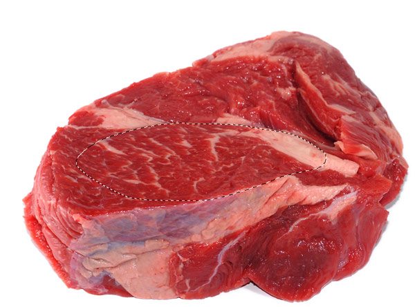
Copy and paste the selection in the main canvas. Use Free Transform (Ctrl/Cmd + T) to rotate and resize the meat to match the dimensions of the letter.

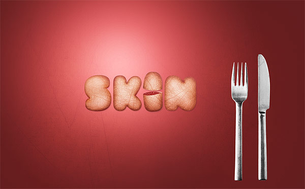
Step 10: Accent the Piece with a Fork and Knife
We can add even more details to the scene. I’d like to add a fork and knife element to the piece to reinforce the idea of the letter "i" being sliced open. Download this image containing a fork and a knife. Use the Pen Tool (P) to extract the cutlery from their background and then place them in our main document.Since both the fork and the knife are too flat, duplicate the layers and set the duplicated layer’s Blend Mode to Overlay in order to increase their colors’ contrast. After doing this, remember to merge each original layer with the duplicated ones because we have to move and rotate the 2 objects, and it’s more comfortable to work with only 2 layers.
Step 11: Modify the Fork
Place the fork at the bottom of the first letter using the Move Tool (V). We want to modify the fork to create the impression that it is poking the first letter ("S"). So add a layer mask to the fork layer, grab a round, black brush with the Hardness at 100% and mask out the upper part of the points of the fork.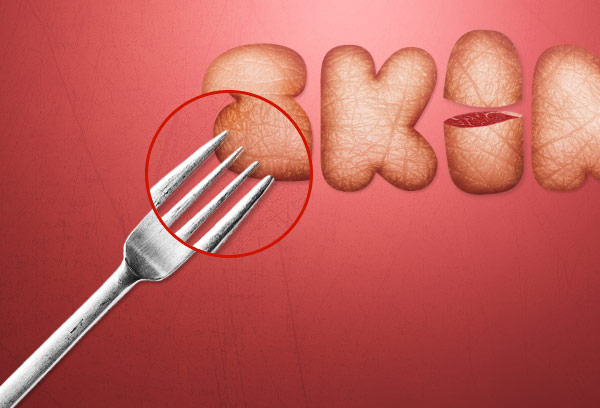
Next, select the layer with the letter "S" on it in the Layers Panel. Grab the Burn Tool (O) from the Tools Panel and use it to darken the small areas where the fork should be poking into the letter. This way, we create the idea that the points of the fork is poking into the inside of the letter.
Step 12: Increase the Contrast of the Composition
The last step is to increase the contrast of the entire composition. There are several ways to obtain this result, but what I will illustrate in this tutorial is the use of a Gradient Map adjustment layer to boost the contrast. To create this adjustment layer, go to Layer > New Adjustment Layer > Gradient Map. Set up the Gradient Map adjustment layer so that the gradient is going from white to black. Move this layer on top of all the other layers and, finally, set the Blend Mode of the layer to Overlay and Opacity to 20%.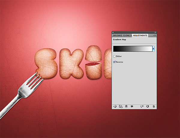
Tutorial Summary
Finito! We’ve finished! We created a text effect that involves superimposing a texture onto it, and then refined our work using the Burn Tool and Dodge Tool. We performed a couple of photomanipulation techniques, including slicing up a letter into two pieces and filling the insides with some meat, as well as making it look like as though the first letter is being punctured by a fork.I hope you have enjoyed this tutorial. I recommend experimenting with your own textures and fonts to create your very own textured, 3D type. (And if you do, don’t be afraid to leave a link showing your work in the comments below.) Photoshop updates

Download Source Files Photoshop updates
- skin_textured_typography (ZIP, 15.10 MB)
No comments:
Post a Comment