
Tutorial Details
- Program: Adobe Photoshop CS3
- Difficulty: Intermediate
- Estimated Completion Time: 4 - 5 Hours
Final Product What You'll Be Creating

Today’s tutorial was inspirited by digital artist Rob Shields who graciously granted permission for us to use his work as inspiration. I chose his work titled “Keep me in the dark.” In this illustration it is essential that you use a tablet; especially for the doodles and the white strokes that will give the portrait a more detailed effect. Let’s get started!
Resources
- I used a picture of myself and a texture that I found on DeviantArt.
Step 1
Start off with the creation of your document and, in this case 1200×1600. If you want to print this you might want to work in CMYK mode, a higher resolution and also 300DPI. You need to make the image black and white pressing Command + Option + Shift + B (Ctrl + Alt + Shift + B on Windows) and make the background dark. Play with the settings and make it darker then the normal settings makes it.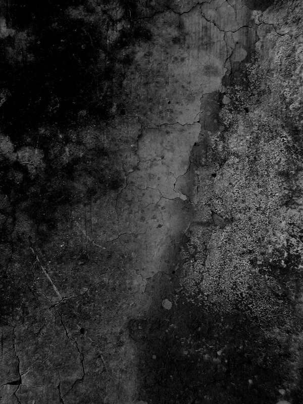
Step 2
Duplicate the background image and darken it a bit more. Then you will apply a mask and use the Linear Gradient (G) to mask the upper part of the second background you have created. Make the lower end darker.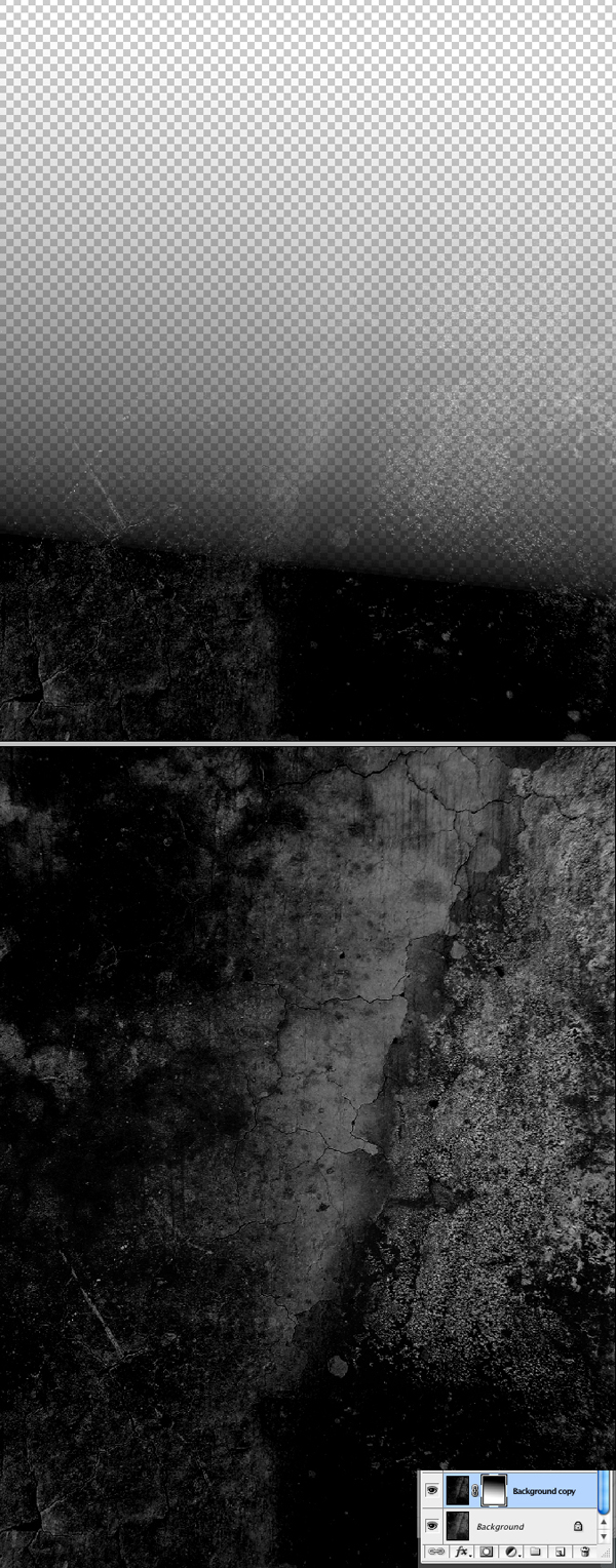 http://photoshopupdates.blogspot.com/2011/08/create-awesome-grungy-style-artwork.html
Step 3
Next import your portrait image into the document.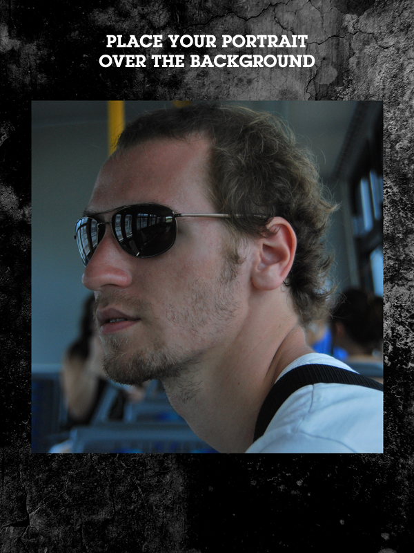
Step 4
Flip the image facing in the direction you desire or leave it as it is if you are happy with the result. You must work carefully at this point and chose your elements and positioning wisely because now you are actually creating your composition. Now make it black and white by using the same shortcut keys Command + Option + Shift + B (Ctrl + Alt + Shift + B on Windows).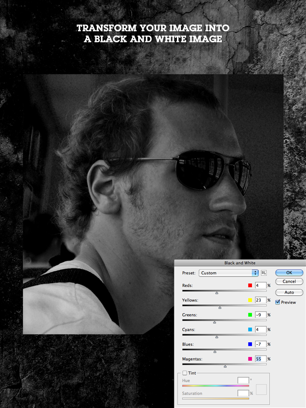
Step 5
Next you need to create a mask for this layer by using the Pen Tool (P) to remove the background of the image and the Brush Tool (B) to clean up the hair. Use a soft brush on the back of the head to make a soft mask for the hair. You will not be able to make a perfect mask using this technique but for this tutorial you will actually recreate the hair and give it a much more interesting and detailed effect later.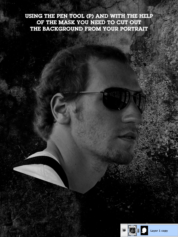
Step 6
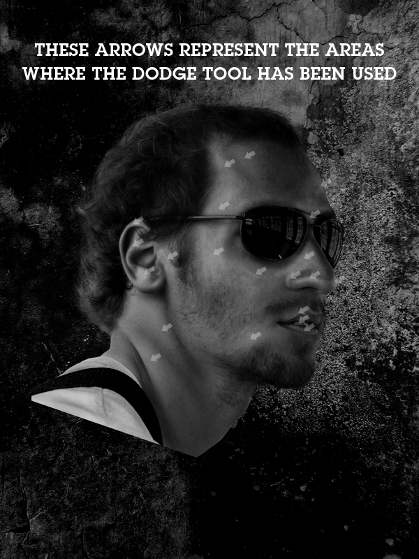
Duplicate the image just to make sure you have another copy if you do something wrong. Now use the Burn and Dodge tools (O) to apply some shadows and lights over the portrait.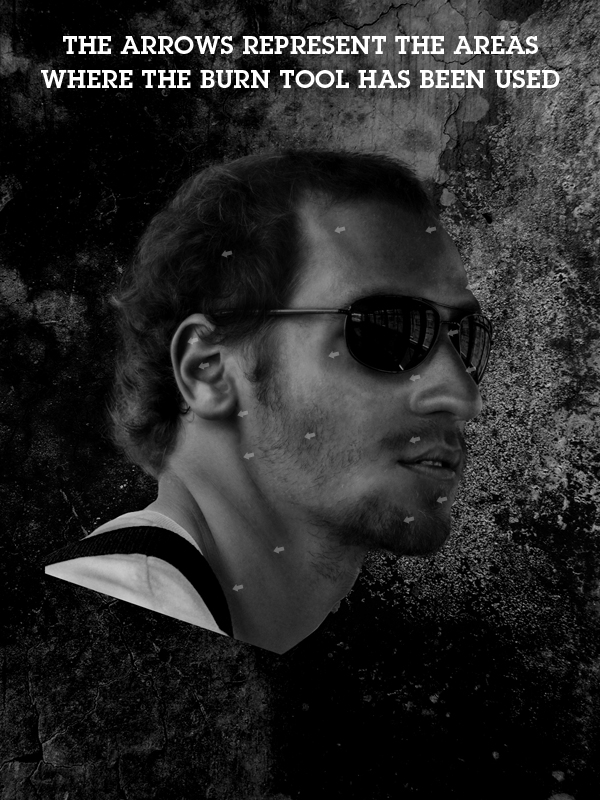
Step 7
Duplicate the layer again and darken it some more using the levels settings or black & white settings. Then use the Burn Tool (O) some more and darken the portrait. This way you will make the illustration look more dramatic.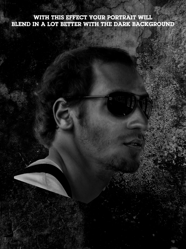
Step 8
Now that the stage is set you need to start using the Brush Tool (B) and the Digital Tablet if you own one and start creating the details. In this case you will start with the beard. Create a new layer the chose a 1 or 2 px brush with the color white. You will also alternate with black from time to time. As you can see in the image below, the strokes have been used on the lips and on the beard and this actually makes the beard stand out more. To create those strokes simply use the tablet and create soft, small strokes as you would naturally do with a pencil.If the strokes seem too bright just lower the opacity of the brush while creating them.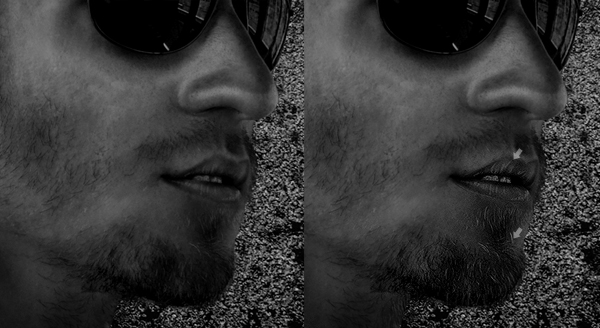
Step 9
Continue to add white strokes all over the face. Mostly on the edges of the face like the ears, cheeks beard, nose, glasses, edge of forehead, t-shirt, etc. As you do this you will notice how everything seems to look clearer, the image will actually start looking like a drawing.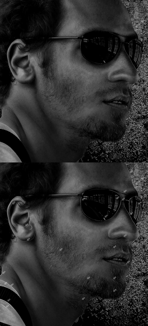
Step 10
Next continue creating strokes but this time create them on a new layer because this will be the hair. Creating these strokes will also make the transition of the hair and background look better and more realistic.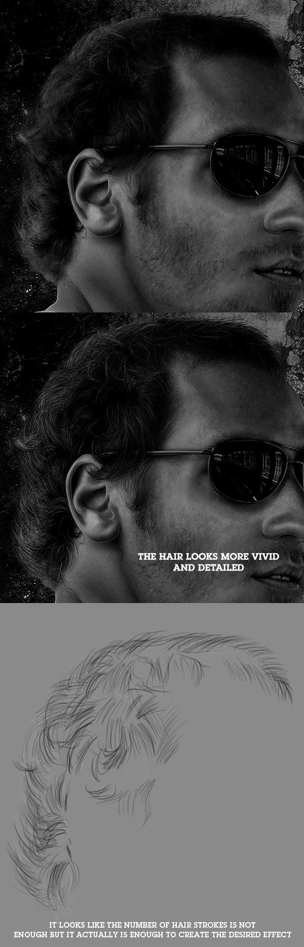
Step 11
Create a new layer and on this layer you will start to create the colored doodles. These are just some colored strokes that will fly around the portrait that you have used. They will give an extra point of focus for the illustration. For the color use #ddad2f. To create them you need to use the Brush Tool (B) and the Digital Tablet. Or they can also be created with the Pen Tool (P) but the result will not be the same.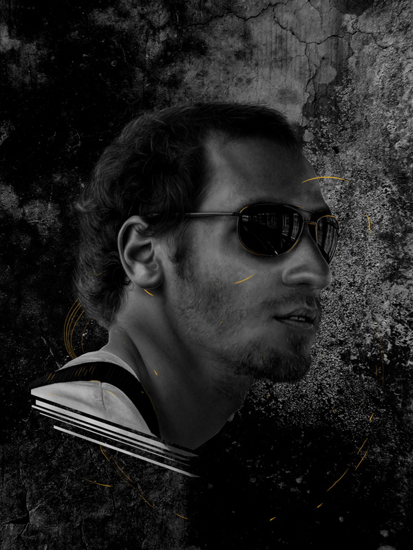
Step 12
Create an empty circle using the same color code. You can also use the Burn Tool (O) over the circle to create some nice color transitions. Also use the tablet to create some more doodles and scratches around the circle. To create the circle you can use the Elliptical Marquee Tool (M).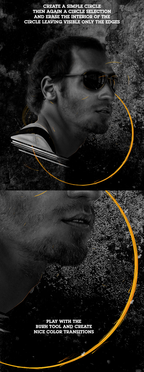
Step 13
Create a new layer above the portrait layers and use the Marquee Tool (M) to create two shapes using the same color code over the glasses lenses. Then set the layer to Soft Light.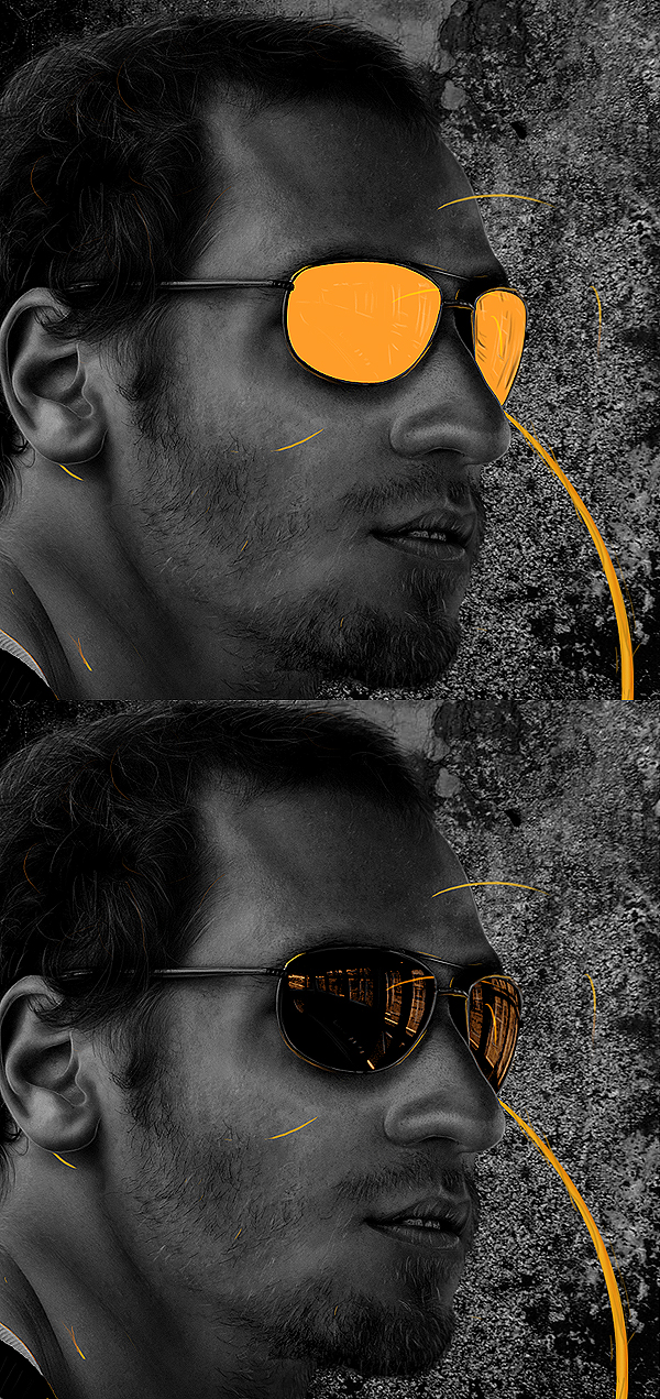
Step 14
Now using the same color code #ddad2f you need to create some shapes using the Pen Tool (P) then fill the shapes with the color and play with the Opacity of these layers. So start creating the shapes as you like (look at the image below for reference) and then play with the Opacity of each shape. Do not forget to create each shape in a different layer. The Opacity used in the tutorial are between 25% – 40%.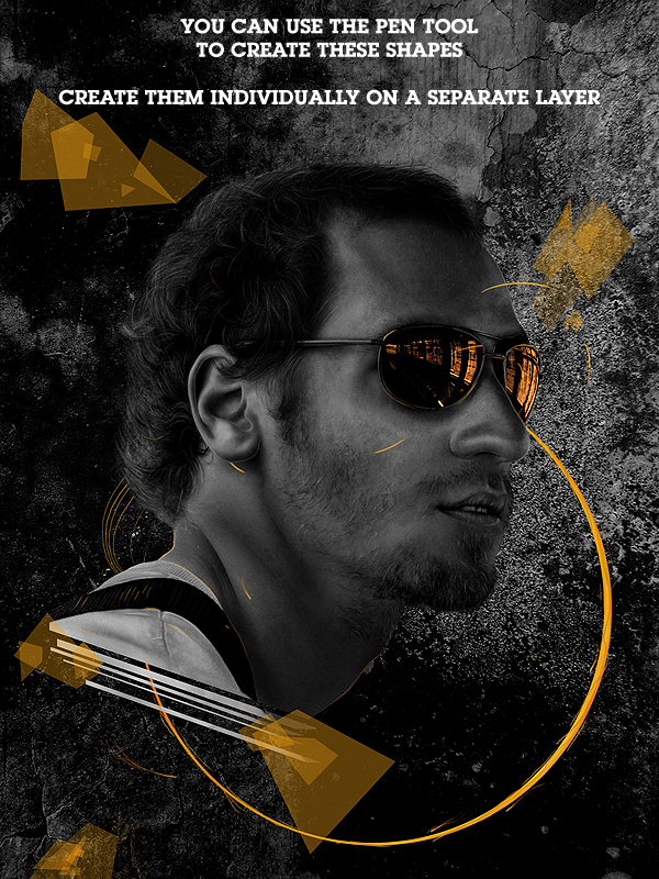
Step 15
Next you will start creating the doodles. Doodles are actually some sketches so you are free here to play around and create whatever you like using the white, 1 px Brush Tool (B). The images below will show you a few ideas of what you can create. Imagine this is a playground and do not worry if you do something wrong.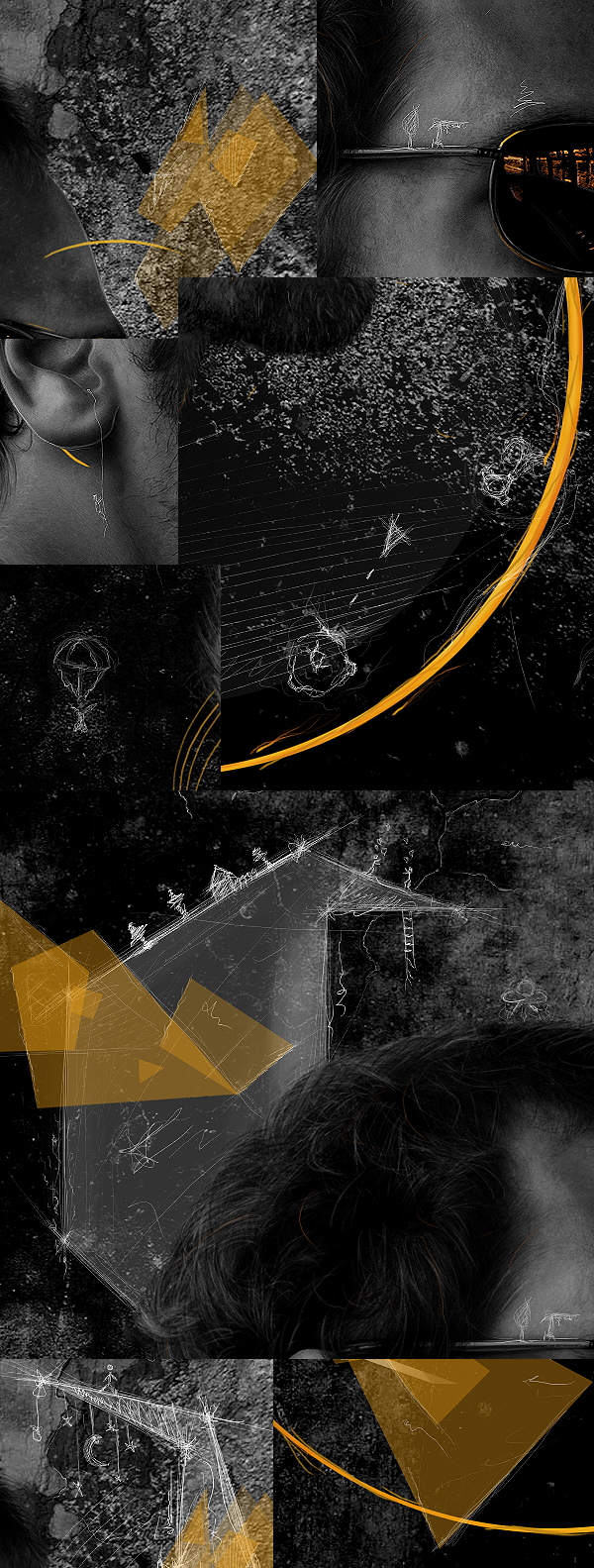
Step 16
The final image should look like below. To make it more interesting go to File > Sharp > Sharpen and you will notice the details are getting more visible.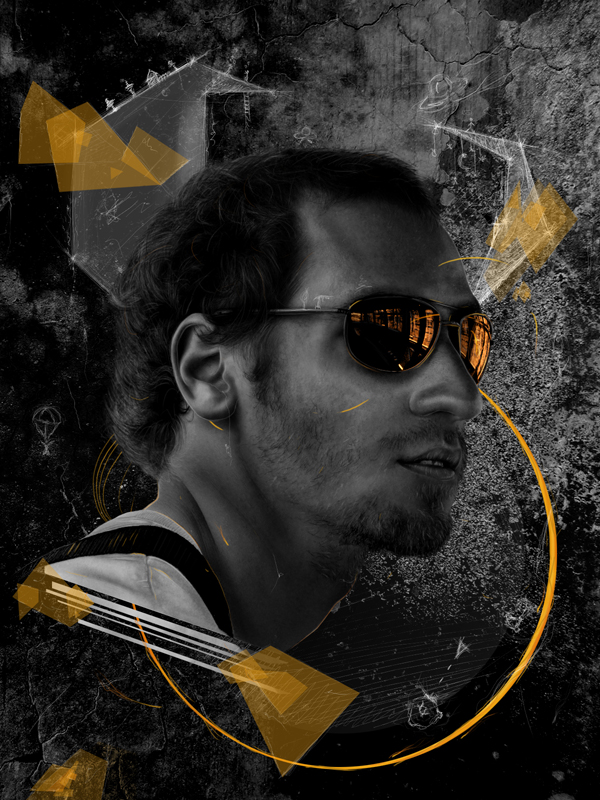
Conclusion
This is the result with the Sharpen effect applied. You can view the final image below or view a larger version here.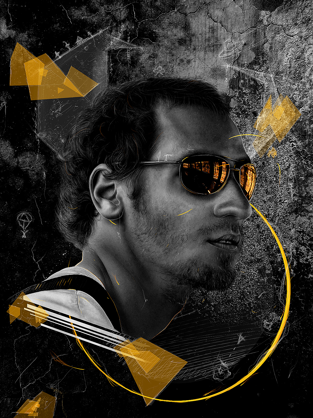
sr:psd.tutsplus
No comments:
Post a Comment